
Earth Tones vs Bold Colors: Which Is Better for Your Luxury Living Space in 2025?
The question isn't necessarily which is better: it's how to use both strategically. In 2025, luxury interior design has evolved beyond the either-or mentality, embracing a sophisticated approach that combines earth tones as foundational elements with bold colors as intentional accent pieces. This creates spaces that feel both grounded and dynamic, timeless yet contemporary.
The Rise of Earth Tones in Luxury Design
Earth tones have undergone a remarkable transformation from the beige-heavy palettes of previous decades. Today's earth-inspired colors draw from nature's most sophisticated palette: rich terracotta, deep olive greens, warm clay, muted ochre, caramel browns, and soft taupe. These aren't your grandmother's neutrals: they're complex, nuanced colors that bring warmth and depth to luxury spaces.
The appeal of earth tones lies in their inherent sophistication. They create a sense of calm and stability while maintaining visual interest through their subtle variations in undertone and depth. Unlike stark whites or cool grays, warm earth tones make spaces feel inviting and lived-in, qualities that modern luxury design prioritizes.
Pantone's selection of Mocha Mousse as the 2025 Color of the Year perfectly captures this movement toward warm, brown-based neutrals that signal a collective desire for comfort and connection to nature. This shift reflects our growing appreciation for slow living and mindful design choices that prioritize wellbeing alongside aesthetics.
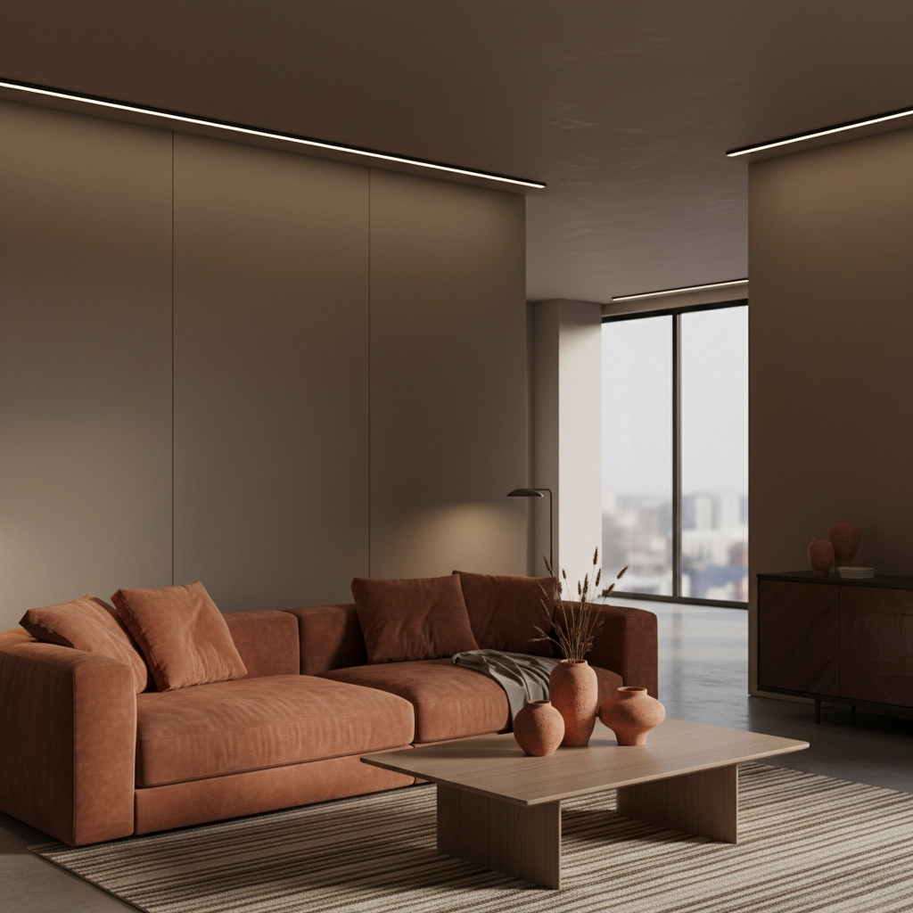
In luxury applications, earth tones work beautifully across different design styles. Whether you're creating a minimalist sanctuary or a richly layered traditional space, colors like warm taupe, deep clay, and soft caramel provide a versatile foundation that never feels cold or unwelcoming. They pair effortlessly with natural materials like wood, linen, and wool, creating spaces that feel organic and thoughtfully curated.
The Sophistication of Bold Colors
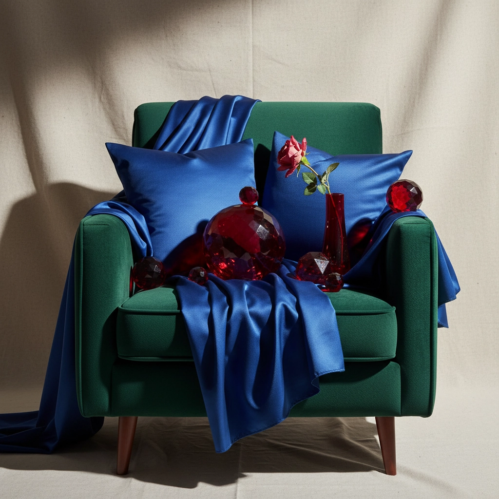
Bold colors in 2025 are defined by jewel tones: rich emerald greens, deep sapphire blues, luxurious ruby reds, and amethyst purples. These aren't the bright, energetic colors of previous trends but rather muted, sophisticated versions that bring luxury and depth without overwhelming a space.
What makes these bold colors work in luxury settings is their restraint. We're seeing emerald greens with gray undertones, blues with deep navy complexity, and reds that lean toward burgundy rather than fire engine brightness. These refined variations allow bold colors to make a statement while maintaining the sophistication that luxury spaces demand.
The psychology behind this trend is fascinating. After years of neutral-dominated interiors, homeowners are craving spaces that reflect their personality and create emotional connections. Bold colors satisfy this desire for self-expression while the muted, jewel-toned variations ensure the result feels curated rather than impulsive.
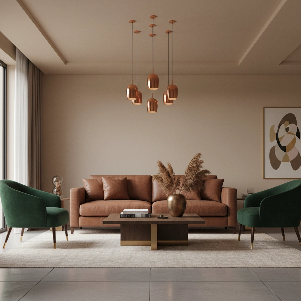
Bold colors excel at creating focal points and defining different areas within open-plan luxury homes. A sapphire blue accent wall in a dining area can create intimacy and drama, while emerald green upholstery on statement seating adds luxury and depth to a living space. The key is using these colors intentionally rather than abundantly.
The Art of Strategic Combination
The most sophisticated approach to color in 2025 luxury design involves layering earth tones and bold colors strategically. This means using warm earth tones as your primary palette: on walls, large furniture pieces, and foundational elements: while introducing jewel tones through carefully selected accent pieces.
This layered approach offers several advantages. Earth tones provide a timeless backdrop that won't feel dated in a few years, while bold accents can be easily updated as your tastes evolve or trends shift. The combination also creates visual depth and interest without overwhelming the senses or competing with architectural details.
Consider a living space anchored by walls in warm taupe, a large sofa in rich clay, and natural wood flooring. Add emerald green velvet chairs, sapphire blue cushions, and copper lighting fixtures, and you've created a space that feels both grounded and dynamic. The earth tones provide stability while the bold accents inject personality and luxury.
The texture plays a crucial role in making this combination work. Pair earth tones with natural materials like linen, wool, and unfinished wood to enhance their organic appeal. Use bold colors in luxurious textures like velvet, silk, or lacquered finishes to emphasize their sophistication. This textural contrast adds another layer of visual interest while maintaining the overall sense of luxury.
Room-by-Room Applications
Different spaces within a luxury home benefit from different approaches to this color strategy. In living areas where you entertain guests, earth tones create a welcoming foundation while bold accent pieces serve as conversation starters. Think terracotta walls with emerald green artistic figure sculptures or rich brown furniture with sapphire blue accessories.
Bedrooms often work best with earth tones dominating the palette, creating a restful environment that promotes relaxation. Here, bold colors might appear in artwork, a single accent wall, or luxury bedding in deep jewel tones that add richness without disrupting sleep.
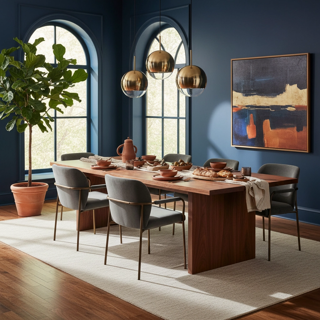
Dining rooms present an opportunity to be slightly more dramatic with bold colors, as these spaces are used primarily in the evening when rich, saturated colors feel most appropriate. A deep emerald or navy dining room with warm wood furniture and brass accents creates an intimate, sophisticated atmosphere perfect for entertaining.
Home offices and studies benefit from earth tones that promote focus and calm, with bold accents that inspire creativity. A warm clay workspace with a statement piece in deep purple or rich green can create an environment that's both productive and inspiring.
Practical Implementation Tips
When implementing this dual-color strategy, start with your largest surfaces: walls, flooring, and major furniture pieces. Choose earth tones for these elements to create a stable foundation. Warm beiges, soft clays, and muted browns work well for walls, while rich wood tones handle flooring beautifully.
Next, select one or two jewel tones for your accent pieces. The key is restraint: too many bold colors competing for attention will create chaos rather than sophistication. Choose colors that have similar undertones to your earth palette for the most harmonious result.
Investment pieces like crystal ball ornaments or marble glass vases work beautifully for introducing bold colors in manageable doses. These accessories can be easily swapped or rearranged as your preferences evolve.
Lighting plays a crucial role in how these colors appear in your space. Warm LED lighting enhances earth tones and makes jewel tones feel rich and luxurious rather than harsh. Consider how different lighting conditions throughout the day will affect your color choices.
The Verdict for 2025
Rather than choosing between earth tones and bold colors, the sophisticated approach for luxury living spaces in 2025 is strategic combination. Use earth tones to create a timeless, welcoming foundation that will serve you for years to come, then layer in bold jewel tones through carefully selected accent pieces that reflect your personality and add luxury.
This approach offers the best of both worlds: the stability and sophistication of earth tones with the personality and luxury of bold colors. The result is a space that feels both timeless and contemporary, grounded yet inspiring: exactly what modern luxury living demands.
The key to success lies in intentionality. Every color choice should feel deliberate rather than accidental, contributing to an overall vision that reflects both sophistication and personal style. When done correctly, this combination creates spaces that are not just beautiful but emotionally satisfying: the ultimate goal of luxury interior design.