
Mocha Mousse vs. Earth Tones: Which Color Palette Is Better for Your Wellness-Focused Living Space in 2025?
When designing for wellness, color becomes your most powerful tool. It shapes how you breathe, how you unwind, and how deeply you connect with your space. This year, two approaches dominate the conversation: Pantone's 2025 Color of the Year, Mocha Mousse, and the broader earth tone palette that continues its sophisticated resurgence.
At DECASA by VS, we've observed how these palettes transform not just rooms, but entire lifestyles. The choice between them isn't about trends: it's about understanding your personal wellness needs and how color can support them.
Understanding Mocha Mousse: The Psychology of Focused Comfort
Mocha Mousse isn't just brown with a fancy name. This warming hue carries notes of cream and rosy-pink undertones that create what color psychologists call "calm indulgence." It's the color equivalent of that perfect morning ritual: rich, comforting, intentional.
In wellness-focused spaces, Mocha Mousse functions as a psychological anchor. Unlike stark whites that can feel clinical or bold colors that stimulate energy, this shade creates what we call "cocooning comfort." Your nervous system recognizes it as safe, familiar, and restful.
The Emotional Impact of Mocha Mousse
This shade evokes the sensory comfort of iced coffee, fine chocolate, and worn leather: materials our bodies associate with pleasure and relaxation. When you enter a Mocha Mousse environment, your stress response naturally diminishes. The color literally signals to your brain that it's time to slow down.
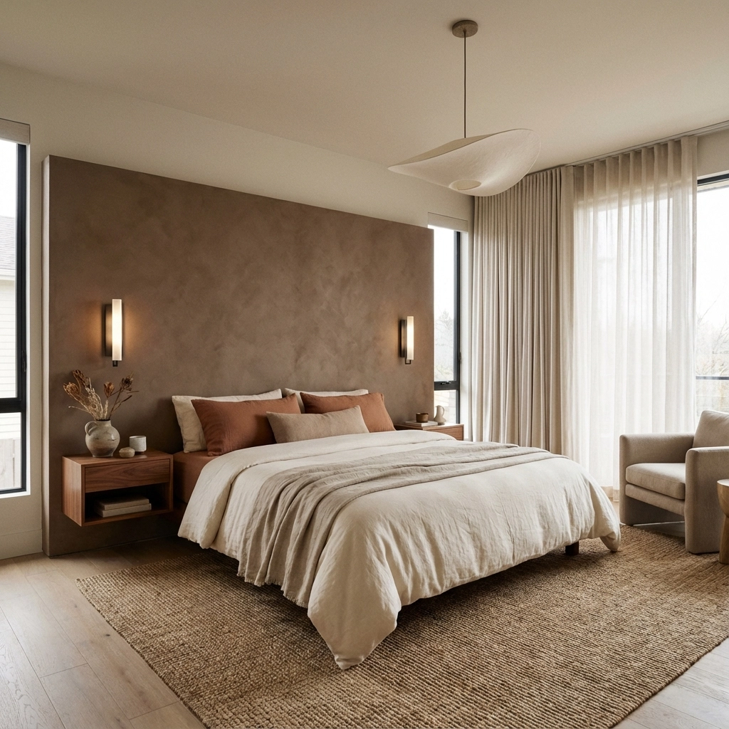
For wellness spaces, this creates an immediate shift from the external world's demands to internal restoration. It's particularly powerful in bedrooms, reading nooks, and meditation areas where deep relaxation is the goal.
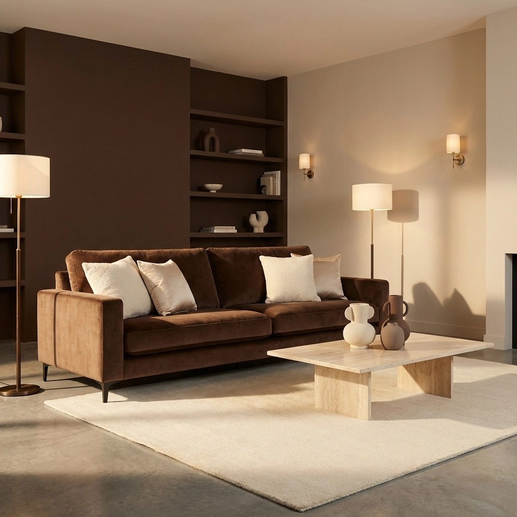
Styling with Mocha Mousse: The DECASA by VS Approach
The beauty of Mocha Mousse lies in its sophisticated versatility. It serves as both a dramatic statement and a neutral foundation, depending on how you layer it.
Wall Treatment: Use Mocha Mousse as an accent wall behind your bed or seating area. It creates depth without overwhelming the space. Balance it with cream or soft beige on remaining walls.
Furniture Integration: Incorporate the shade through statement sculptural pieces that add both color and artistic interest. Mocha Mousse ceramics or textiles bring the wellness benefits without committing to permanent color.
Layering Strategy: Pair Mocha Mousse with sage green, soft blues, or muted purples for contrast that maintains the calming effect. These combinations create visual interest while preserving the meditative quality.
Earth Tones: The Expansive Wellness Palette
Earth tones represent nature's own wellness prescription. This family includes terracotta, ochre, sienna, warm grays, and various browns: colors that ground us because they mirror the natural world our bodies evolved to find comforting.
Unlike the focused approach of Mocha Mousse, earth tones offer variety within harmony. You can shift between energizing terracotta and calming taupe within the same space, creating different wellness zones that support various activities and moods.
The Biophilic Connection
Earth tones support biophilic design principles by creating visual connections to nature even in urban environments. Research shows that spaces incorporating natural color palettes reduce cortisol levels and improve cognitive function. Your wellness space becomes a retreat that genuinely restores rather than simply decorates.
This palette works particularly well in open-concept spaces where different areas serve different wellness functions: a warm terracotta dining area for social connection, muted browns in the living space for relaxation, cream tones in work areas for focused calm.
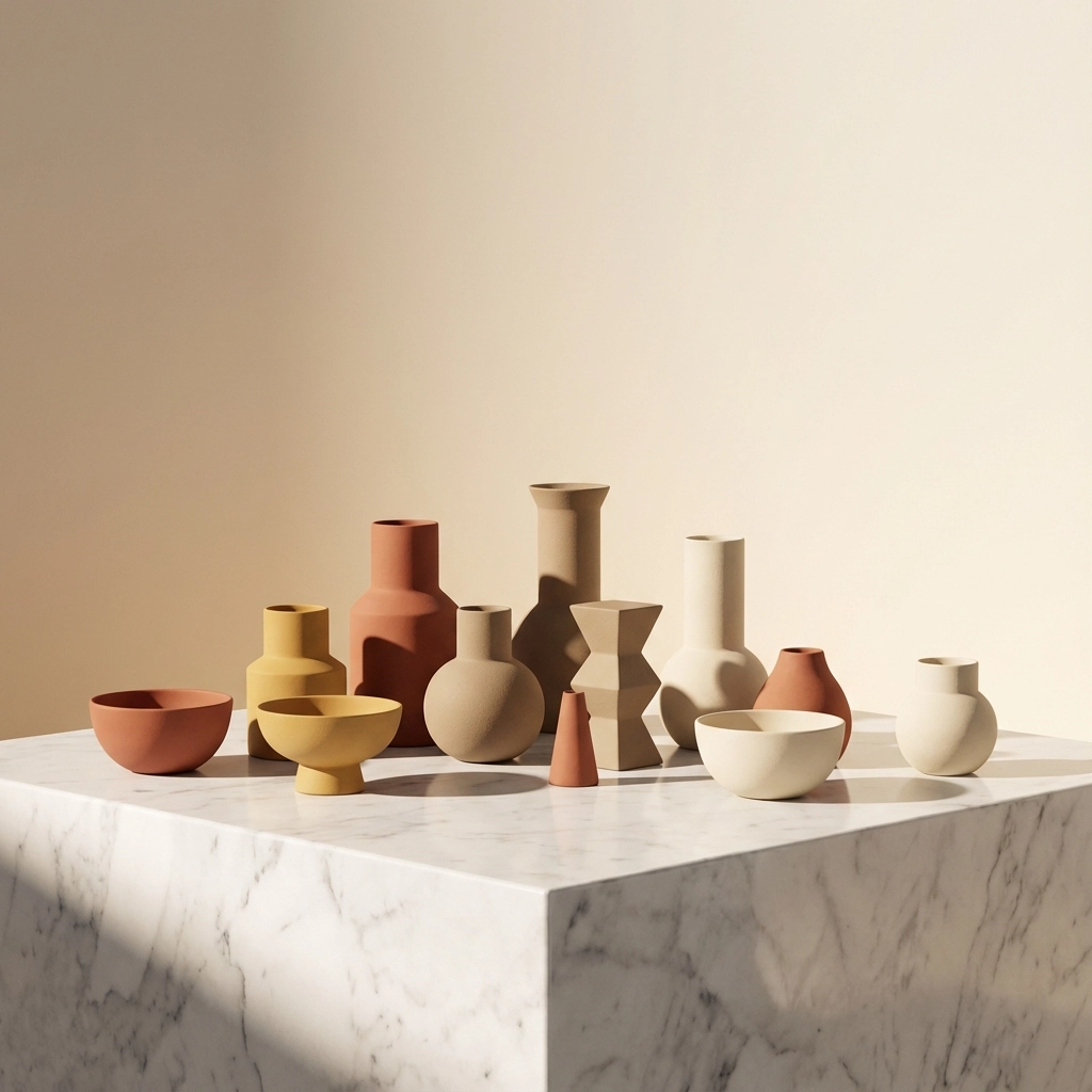
Curating Earth Tones: Beyond Basic Beige
The key to successful earth tone palettes lies in intentional curation. Random browns create chaos; thoughtfully selected natural hues create sanctuary.
Temperature Consistency: Choose either warm earth tones (terracotta, golden ochre, warm brown) or cool ones (gray-beige, mushroom, stone), but avoid mixing temperatures randomly.
Texture Integration: Earth tones shine when paired with natural materials. Ceramic vase collections in varying earth tones create visual rhythm while maintaining the natural connection.
Accent Strategy: Use the deepest earth tone as your accent color: perhaps in modern abstract sculptures or European-style decorative elements that add sophistication without disrupting the grounded feeling.
The Wellness Comparison: Function Over Fashion
When choosing between these palettes for wellness, consider how each supports your specific needs.
For Deep Restoration: Mocha Mousse creates the enclosed, womb-like comfort that supports deep healing and rest. It's ideal if your wellness focus is recovery, meditation, or managing high stress levels.
For Balanced Living: Earth tones provide the visual variety that prevents spaces from feeling stagnant while maintaining the natural connection that supports daily wellbeing. Choose this approach if you want wellness integrated into active, multi-functional living.
For Seasonal Wellness: Earth tones adapt naturally to seasonal changes: add warmer terracotta accents in winter, cooler stone tones in summer. Mocha Mousse remains constant, providing stability if your wellness practice benefits from consistency.
Practical Implementation: Mixing Palettes with Purpose
The most sophisticated approach often combines both strategies. Use Mocha Mousse as your primary foundation: perhaps in major furniture pieces or a feature wall: then layer in complementary earth tones through accessories and textiles.
The DECASA by VS Layering Method
Start with Mocha Mousse as your anchor color in one significant element: a sofa, accent wall, or major art piece. This creates the psychological safety of focused color while leaving room for earth tone variety.
Add earth tones through:
- Nordic ceramic collections in cream and soft terracotta
- Natural wood elements in warm brown tones
- Textiles in ochre or muted sienna
- Modern ornamental pieces that bridge both palettes
This approach gives you the wellness benefits of both: the comfort of Mocha Mousse's consistency and the vitality of earth tone variety.
Lighting Considerations for Both Palettes
Both Mocha Mousse and earth tones require thoughtful lighting to prevent spaces from feeling dim or cave-like. Warm, layered lighting enhances their wellness properties while maintaining sophisticated aesthetics.
Consider modern wall lighting that provides both function and design interest. The key is creating multiple light sources at different levels: ambient lighting to showcase the color depth, task lighting for functionality, and accent lighting to highlight your decorative elements.
Making Your Decision: Personal Wellness Assessment
Your ideal palette depends on your wellness goals and lifestyle needs.
Choose Mocha Mousse if you:
- Crave deep, restorative spaces for decompression
- Prefer sophisticated minimalism with strategic accents
- Want a trending, design-forward foundation that still feels timeless
- Need consistent visual calm for stress management
Choose Earth Tones if you:
- Want connection to nature through varied, grounding colors
- Prefer visual richness that prevents monotony
- Live in multi-functional spaces that serve different wellness purposes
- Enjoy evolving your space seasonally while maintaining wellness benefits
Conclusion: Wellness Through Intentional Color
Whether you choose the focused comfort of Mocha Mousse or the expansive grounding of earth tones, the key lies in intentional implementation. Both palettes support wellness when thoughtfully applied, but they serve different aspects of wellbeing.
At DECASA by VS, we believe the most effective wellness spaces often incorporate elements of both approaches: using Mocha Mousse's psychological anchor paired with earth tone accents that keep spaces feeling alive and connected to nature.
The best palette for your space is the one that makes you breathe deeper when you walk through the door. That's the true measure of wellness design success.